Our brief was to develop a new creative platform and visual identity that could give the brand more emotional resonance and therefore more repeat purchases and customer loyalty.
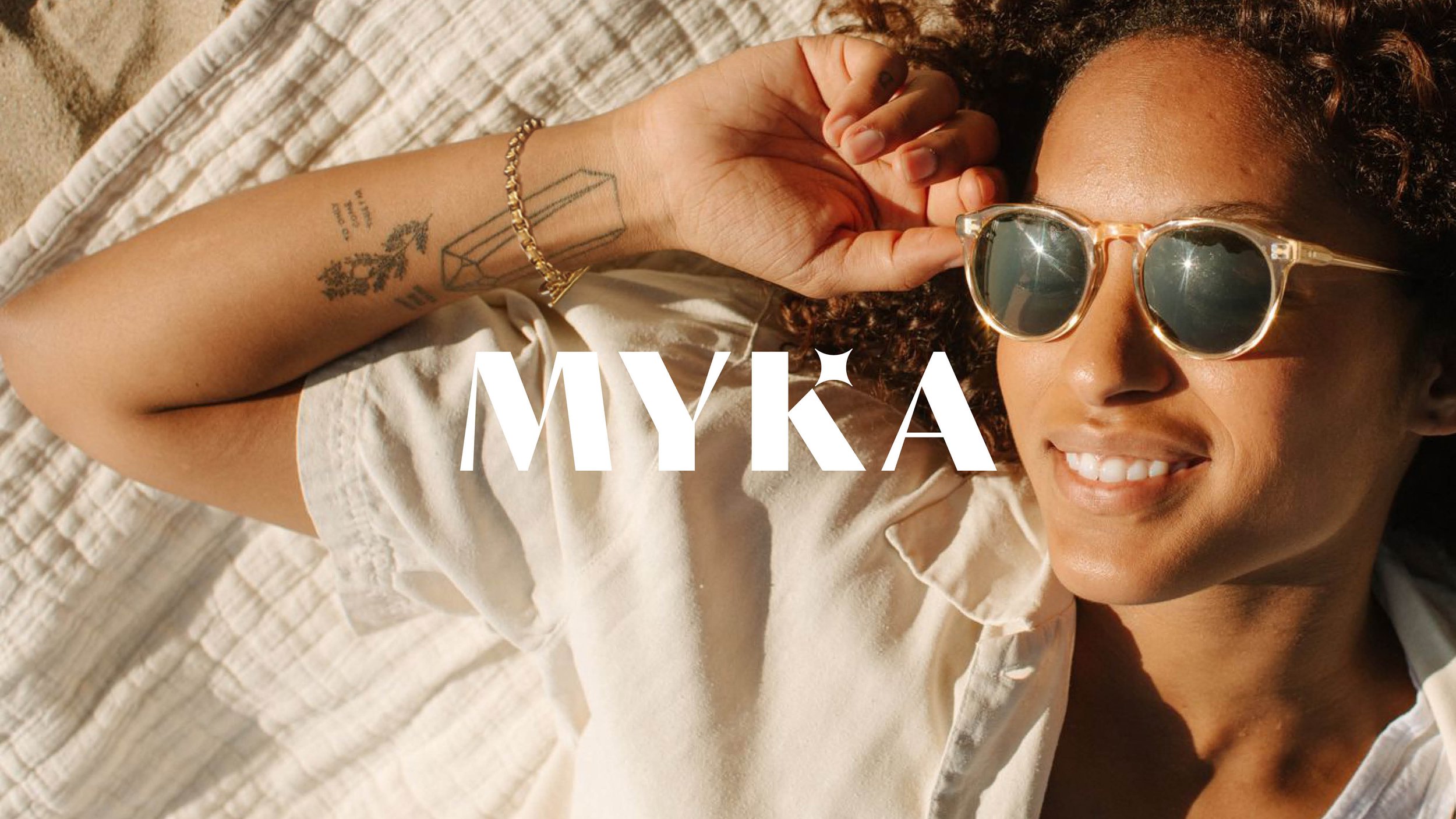
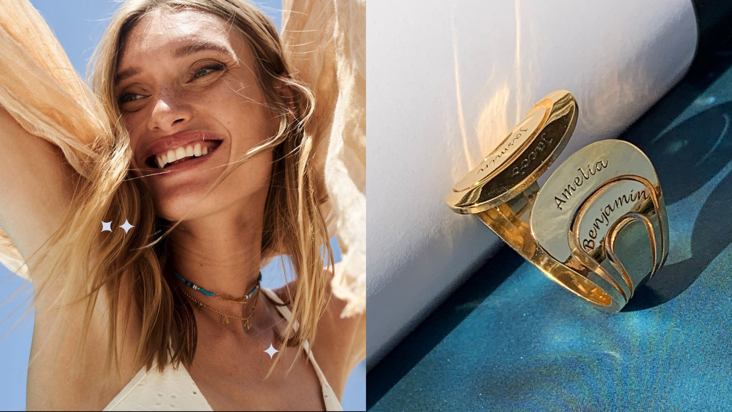
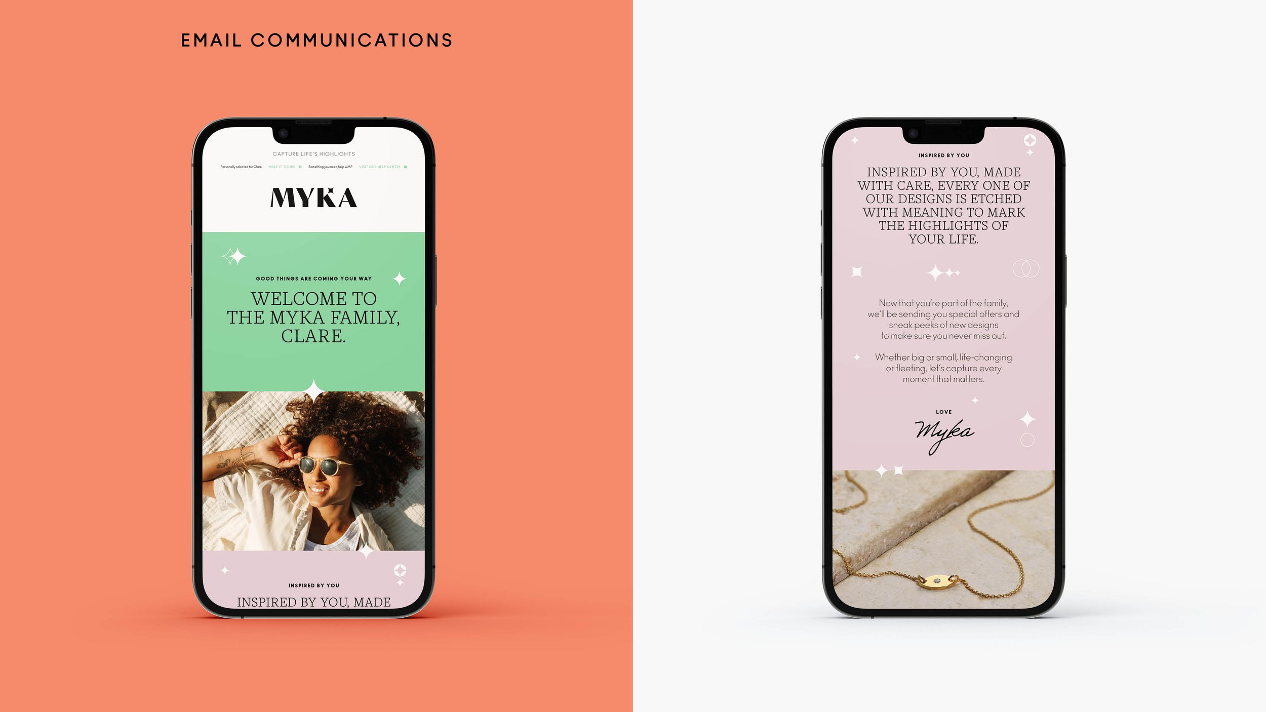
Personalisation is at the heart of MYKA’s offering so we developed a proposition centred on the idea of marking “life’s highlights”. The concept of “highlights” was then brought to life through the new visual and verbal identity.
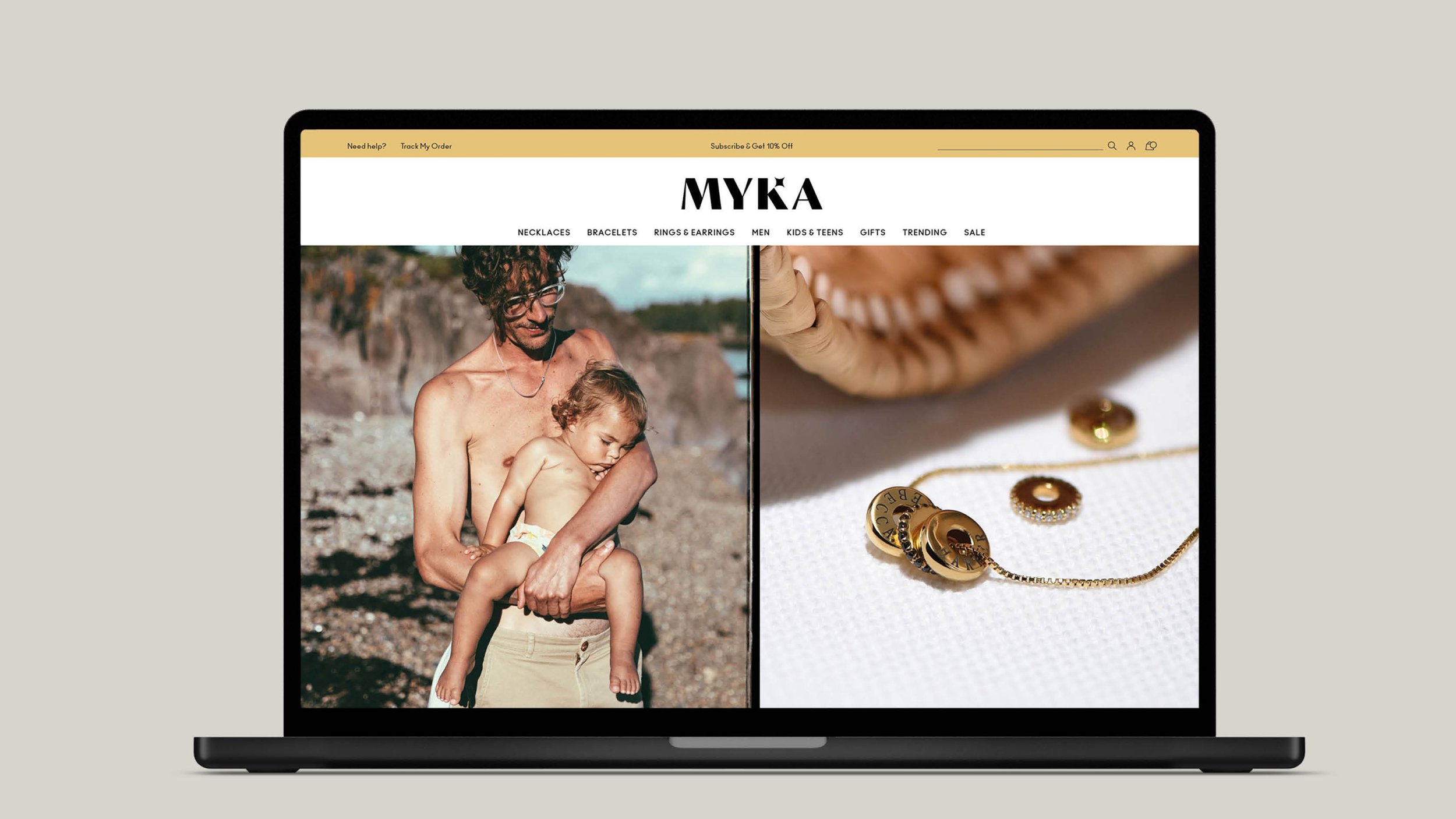
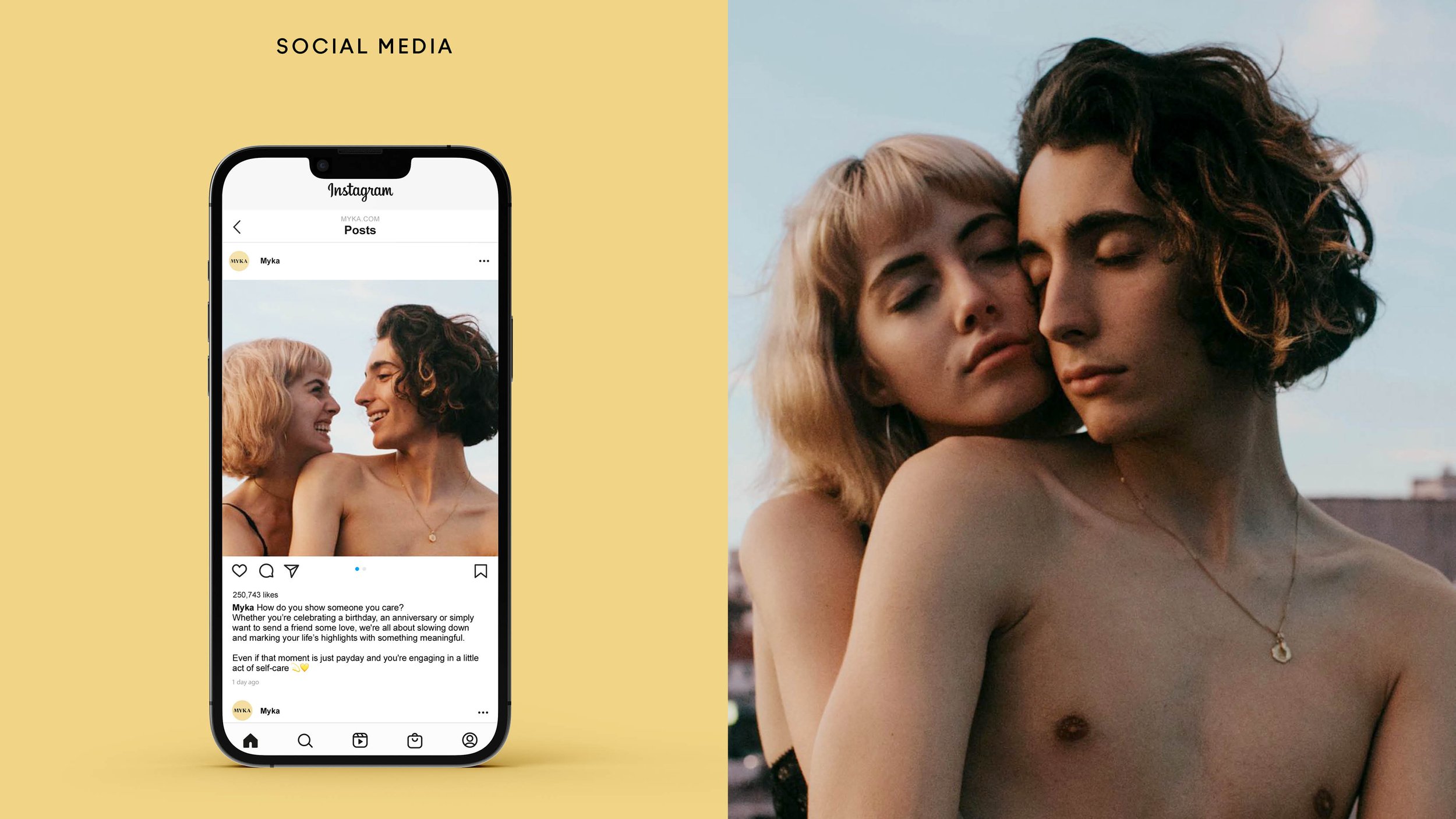
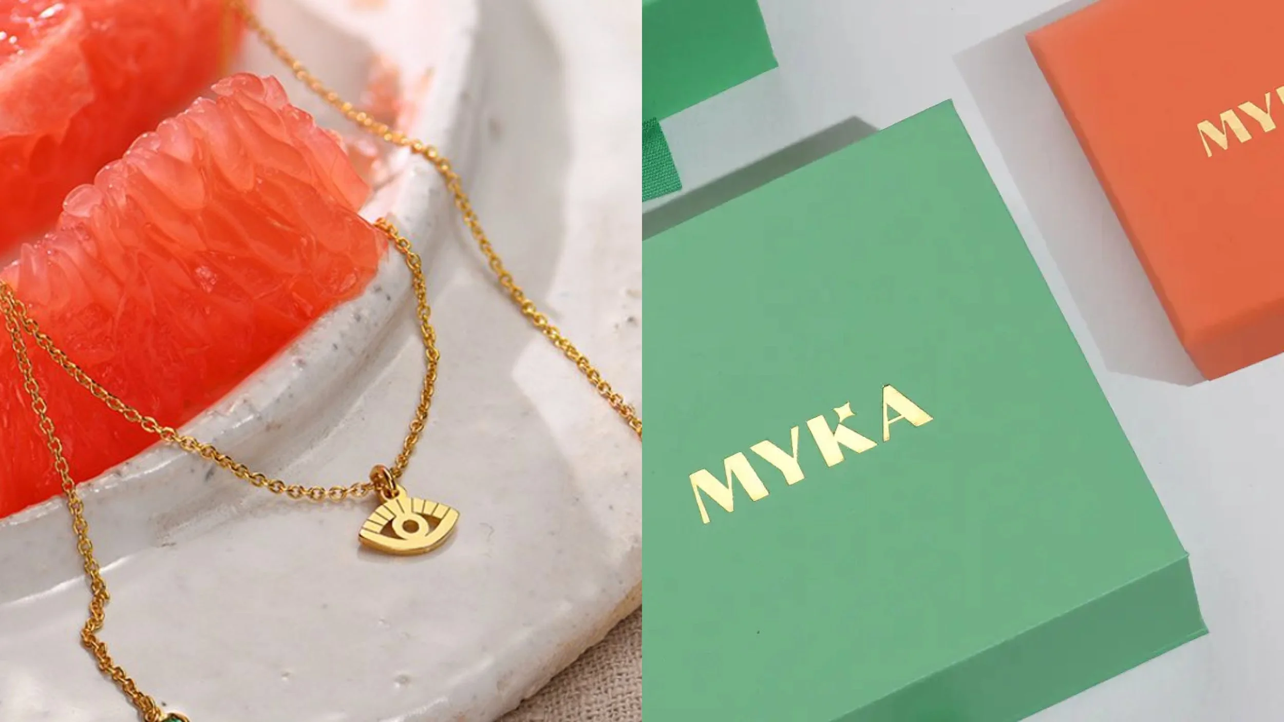
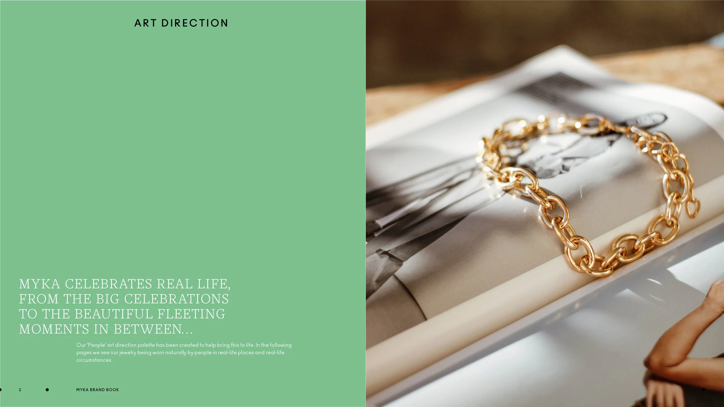
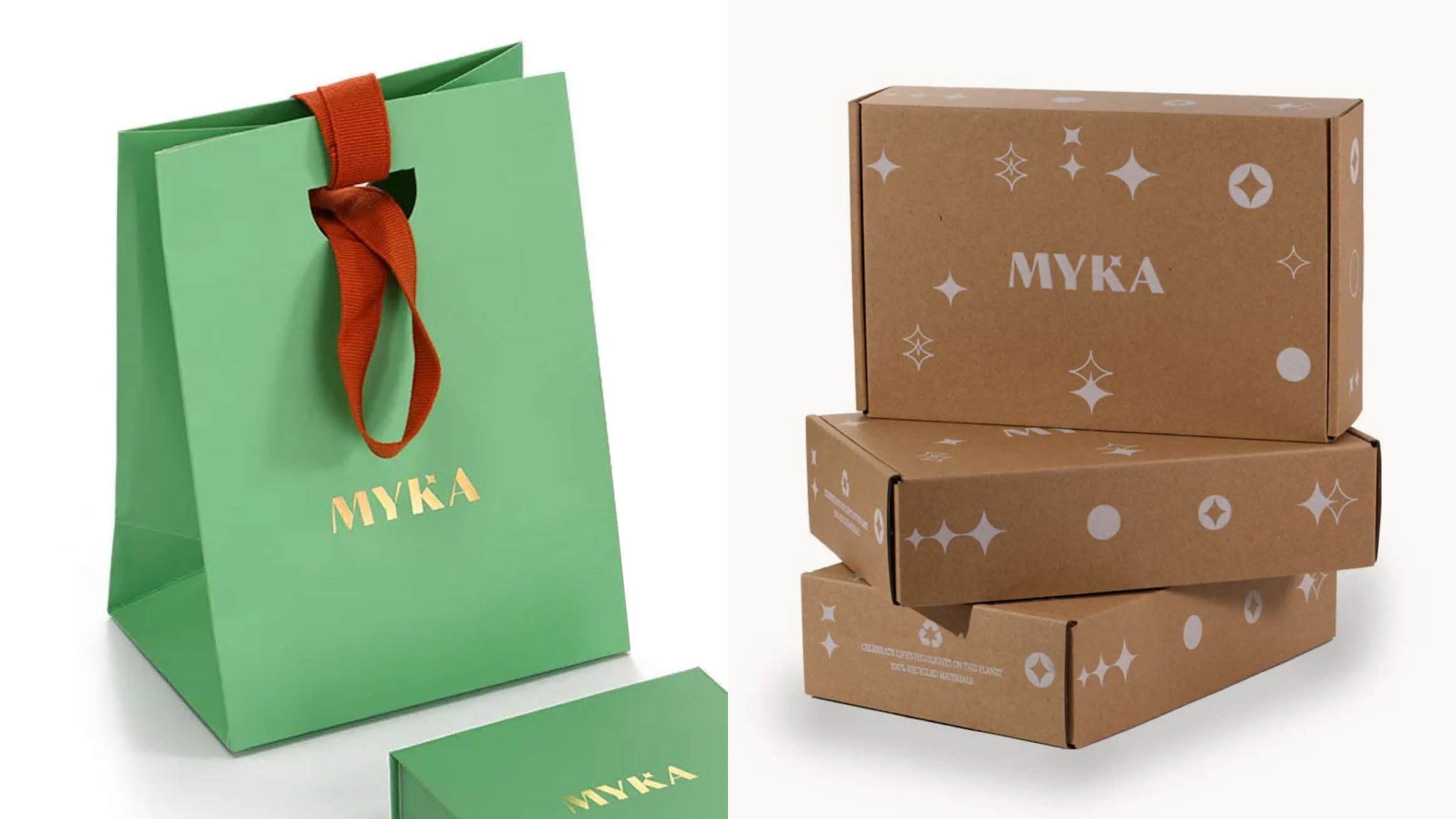
The new logo included a unique highlight device (the MYKA ‘sparkle’), representing the sense of magic that surrounds life’s memorable moments. The new art direction also sought to capture authentic, intimate ‘highlights’ between people, moving away from the typically staged photography used by the jewellery category. Packaging was elevated from something purely functional to a much more tactile experience, worthy of a life’s highlight.


That was one-good SHOW!
Ronnie
Elgavish
VP Global Marketing